Magazine Design - "body identity" article

"Body Identity" article and shoot

insert article art
★ Main article is on body dysphoria based off of credible sources.
★ Interview and photo shoot of 2-3 people suffering from dysphoria
- Picture will be full body with 1 or 3 people in them.
- Casual posing, nothing big, no props.
★ Interview questions:
- "How does dysphoria affect you?"
- "How often do you suffer from bouts of dysphoria?"
- "What do you do to get over it?"
- "Do you think that dysphoria should becomes better known as a mental illness over how it seen presently, as an episode of unease brought on by dissatisfaction?"


Magazine Design - 2-page spread

"Love, you" body confidence shoot, 2-page spread

This section is about general body positivity with mainly photography, a medium length article and small captions that present the Q&A 

I plan to include
★A small article about body image's key role in self-esteem.
★Past interview excerpts about body image from famous women like Rhianna.
★Model's Q & A (3).
- Would you consider yourself a confident person?
- How have beauty standards affected you?
- What do you find most useful when you're trying to express yourself? Art, make-up, music, or fashion?
★Cutouts and clip-art of response-related content.


Magazine Design - Cover

Types of shots

I plan to use a mix of full shots and wide shots. These shot's distances allow for most of the person to show, which is great for exhibiting the body positive and art themes of my magazine. I also plan to use a close-up eye-level shot which brings in a level of intimacy.


Cover page without any coverlines or details.

Student Survey

Survey Analysis


For my survey, I wanted to figure out the general interest of my class audience whilst also bringing in a couple of theme-specific questions.

Here are screenshots of my results:


A predicted, there are far more females than males in my class, the same goes for age group, all older teenagers in 11th and 12th because those the only grade levels present in my class. I mentioned this in my Assumptions post.


When asked “How do you feel about art as a way of self-expression and as a self-esteem booster?” all my respondents answered positively except for one respondent writing “it is weird”. In the next question, “Would you read a magazine about body positivity and self-expression”? The same pattern followed with one “maybe”.

The remaining three questions are all about personal interest. My results showed that the class was primarily interested in alternative music and fashion and ornate layouts.


Magazine Design - Photography's Comp

Composition

In art and design, composition is an image's structure. An image with good composition when put in black & white shows contrasting values that make the image easy to read. Bad composition looks murky because of all the similar shadow values, which creates a bad visual hierarchy. To achieve good composition, I will be using blurring and desaturating methods on the backgrounds of my images, which in the example is represented by the gradient. My second background which is represented by the darkest blue will also be blurred but not to the degree of the true background, it also will not be desaturated. The foreground will be subject to saturating and colored filters and in general most of the editing. In the example, I am also exhibiting the sort of shots and framing going for, something playful and bit feminine for my feature since I am choosing between my Love, You, and Body Identity article.
(self-produced example)


Magazine Design - Photography/Graphic Design

Magazine Design 2

My photography is going to be shape-centric, as I mentioned in my Preliminary, with dull colors and strong accents. Each section will have their own color scheme in total there will be 4 sets for my 4 sections, in order of importance and percentage: brown/tans, blues, pinks, and lastly, greens. 
Design and color attributes I plan to include:
  • Sans serif fonts
  • Lots of pretentiously ironic quotation marks (everywhere)
  • Lot's of Virgil Ablo inspired stuff in general 
  • Chromatic aberrations and colorized images
  • Torn / cut look of pasted images
  • Color boxes for text and images
  • 10% Army green, 5% Neon green 
  • 15% Navy Blue, 10% Light shades of Arctic Blue
  • 15% Dark pinks, 10% Lighter shades of pink
  • 20% Dark to mid Chocolate tones, 15% Nude shades

Magazine Design - Cover lines/Content

Magazine Design 1

To provide the truest and most detailed version of living with a shapely body I plan to use my own classmates and friends. I will be interviewing them on a variety of topics such as daily routine, background info, and info on how their weight or shape has affected them in daily life as well as portray their beauty through meaningful photography that draws the line between myb theme and topic.
The remaining sections will be based on previous interviews and articles about famous shapely celebrities such as Rihanna, Lizzo and Sofia Vergara.

Preliminary Assumptions on the Survey

Preliminary Assumptions

My demographics age is going to be between the ages of 15 -18, in other words, young adults and teenagers because those are the ages that make up my high school's population and thus most of my actual viewers. My gender demographic is going to be primarily females because they make up most of my media studies class and dominate when it comes to social information as they are more likely to care about social policies and movements. In addition, they make up most of the group affected by beauty standards. In terms of race and heritage trends in my viewers, they will be primarily Hispanic and African American because they the group that dominates the entire school, including myself as I am from Cuban-Venezuelan heritage, and again, they are the primary group affected since we tend to develop curvier with slower metabolisms. Lastly is interest, Which assumes will be fashion, music,  and informative articles since that is what a teenager such as my friends and myself are interested in.

Research on Demographics

Image result for digital magazine demographic charts 2018Research 7


Demographics can be defined as the audience you are marketing towards. Demographic is dependent on factors like a person’s age, gender, heritage and general interest. Factors can broaden depending on what you’re marketing but I’m limiting to what I’ve previously mentioned since I’m marketing a body positivity magazine. Figuring out your demographic gives you insight into consumer trends, which will let you know what your content should be. In a later post I will be analyzing the results of a survey I sent out to all my classmates.

Citations and additional info used:

“Demographic.” Merriam-Webster, Merriam-Webster, https://www.merriam-webster.com/dictionary/demographic#note-1.

“American Demographics Magazine.” HBS Working Knowledge, https://hbswk.hbs.edu/archive/american-demographics-magazine.

Preliminary Evaluation


This is what I want to see in my magazine:

Evaluation
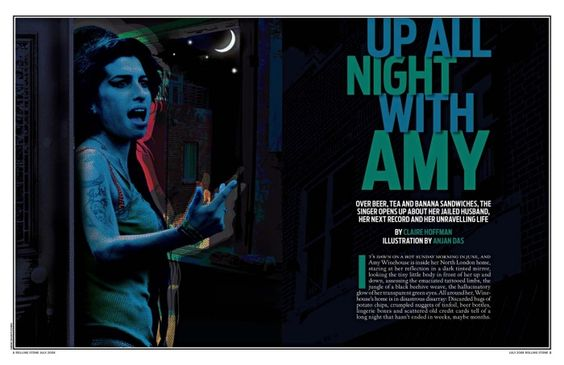
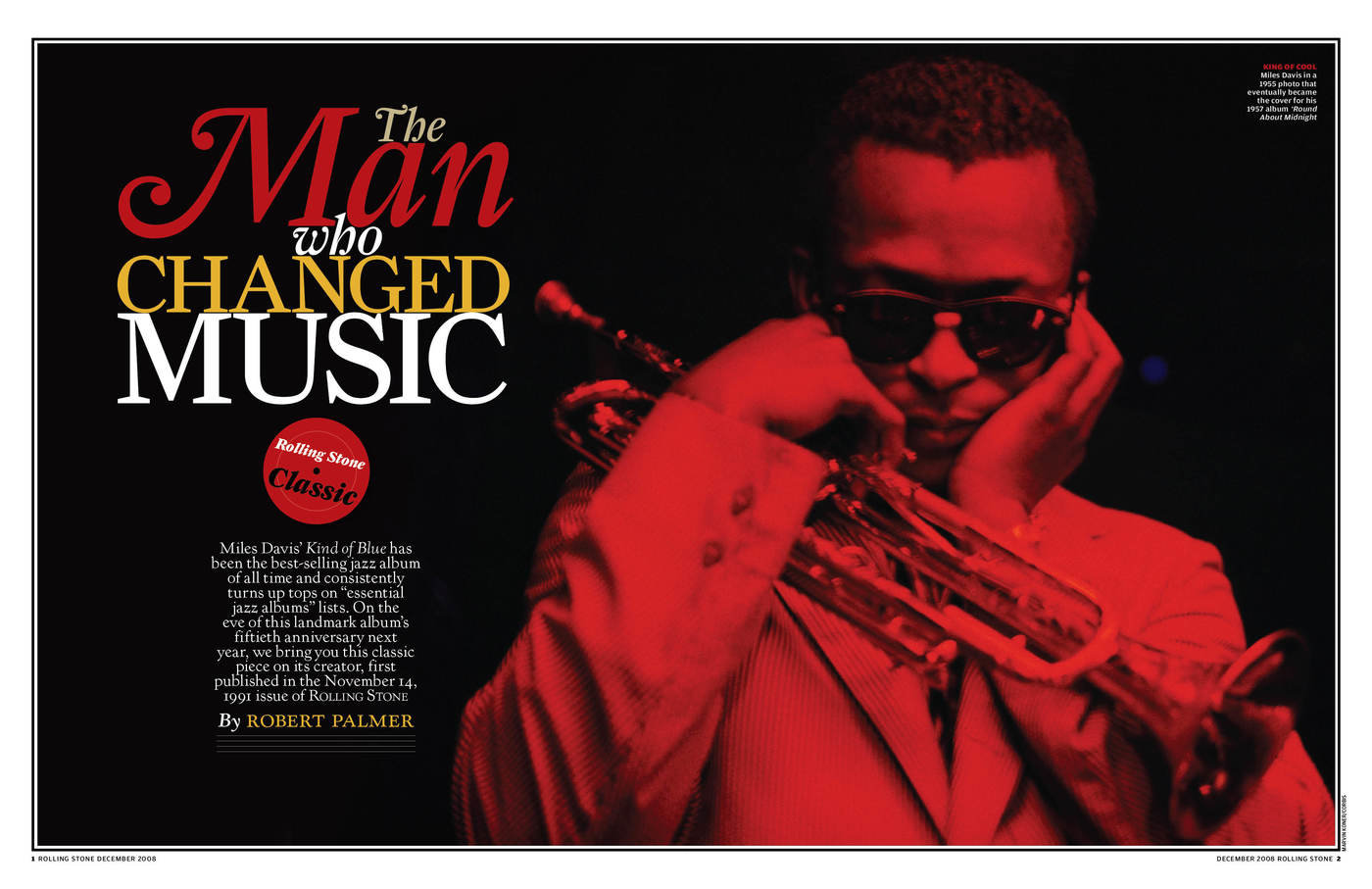
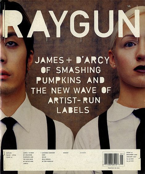
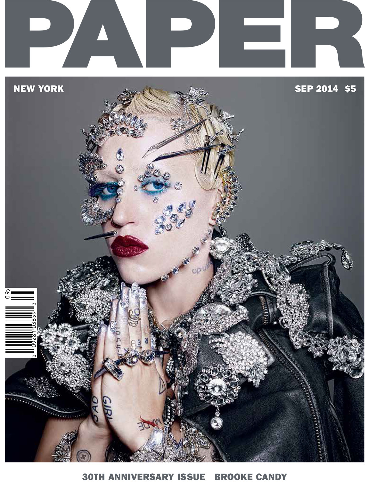
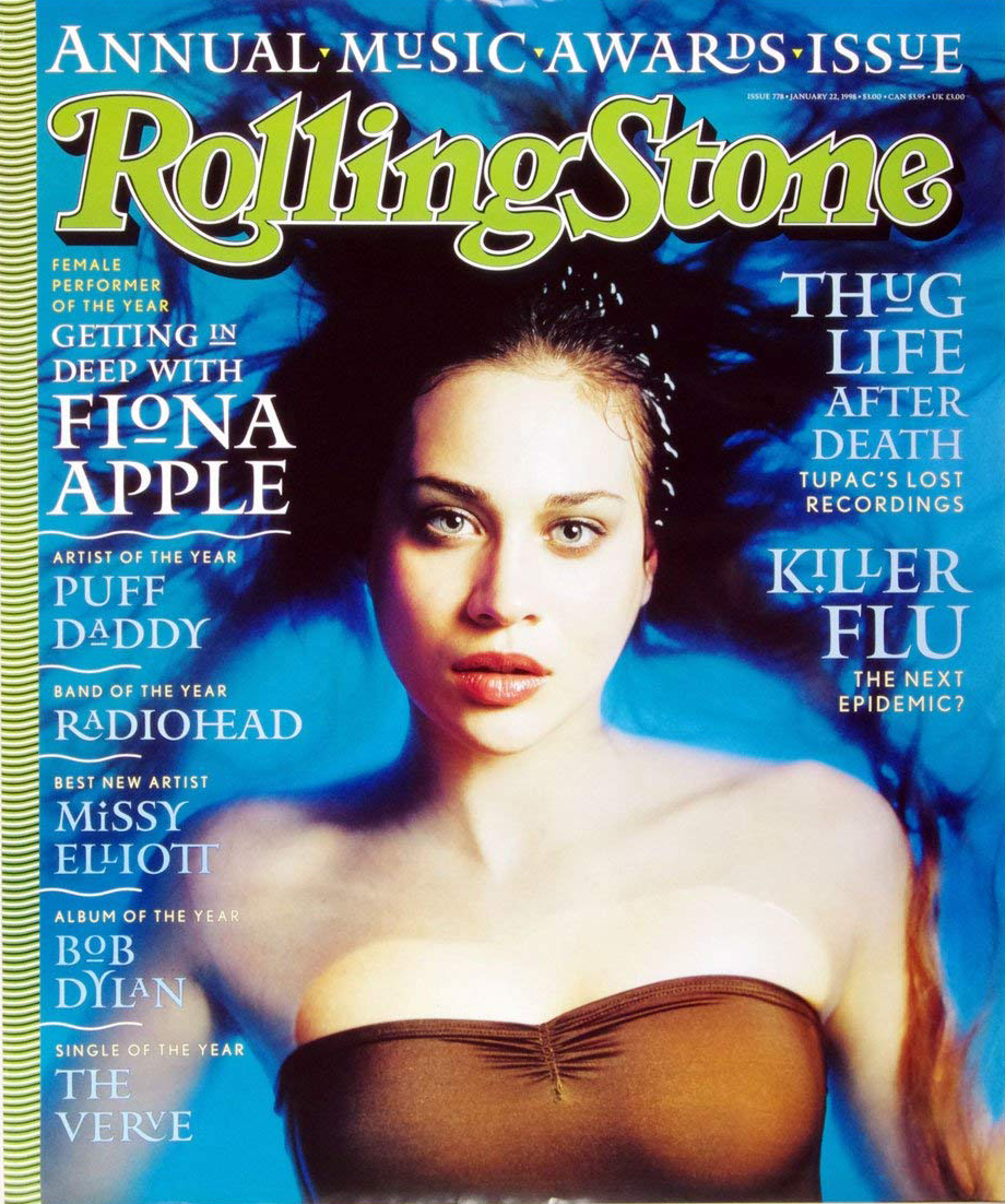
My team's theme is body positivity which I plan on presenting in a artistic and punk way by following a mix of conventions from magazines: Dazed & Confused, Paper, and the Rolling Stones. I will be portraying two types of body positivity: curvy or shapely women body positivity and transitioning(transgender) body positivity, I will be including articles about how their shape has effected their daily life and what sort of dysphoria they face. I have been planning to use this theme from the beginning, so I've already given some thought over the kinds of shots and border decor I want to use. From what I've gathered, all my team mates are taking a pretty similar approach aesthetic-wise, primarily using fashion magazines as a source of inspiration.I will be self producing and editing my assets for my spread.

Layout

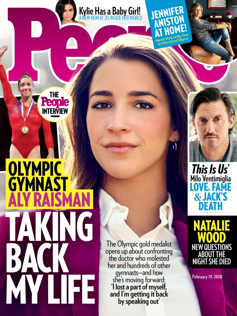
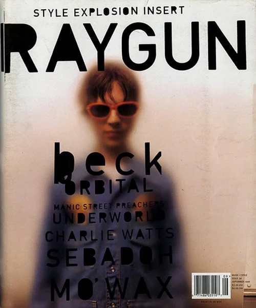
As previously mentioned, I will be focusing on using a layout who's conventions follow closely with indie and RNB type magazines. This calls for large block lettering and condensed sans-serif fonts all over my spreads. Minimalist spread design reliant on visual story telling using lone landscapes and models with captions used to tell what they are wearing. Muted color scheme with some pops of color like red, green,and orange.

Text Fonts and Styles
This will be used to determine the hierarchy through out my cover and spread. I will be using a variety of bold, condensed, Arial type fonts and typewriter font highlighted. I plan on using a variety of color blocks to make my articles stand out. Lastly, I will use serif fonts to accent the beginning of my articles and decor font for the backgrounds.

Photography
The photography I'll be using will be very on theme editing-wise. They will primarily portray women who's shape doesn't fall in usual beauty standards and transitioning(transgender) body positivity. I I want my picture to have not only a consistent color scheme but a shape theme as well, where I will be using silhouettes and negative space in the photos to capitalize on body shape. To really instill that indie rock quality of the Rolling Stone, I will also have my models made up to fit that 90s rock era aesthetic. I'll use cutouts sparingly throughout my spread for sections like "style hunt" and my collages.

Research on Double Page Spreads


Research 6

This spread consist of collages, a main story, images with captions and a focus image that relates to the story. Double Page spreads are usually used to convey an important narrative about a celebrity or social movement. It conventions are defined by the topic at hand. The example I'm using are also serving as inspiration for my layout.

Double Page Examples


From the Rolling Stone


Research on Magazine Genres

Research 4

The term genre is loose, it basically just means category. To simplify this, I'm going to limit them to my examples, listing their conventions and separating them by style and functionality.

Style genres and their functions


Indie Rock/Grunge - Music, drama, informative

Example
Raygun & the Rolling Stone
RAYGUN magazine breaks convention by never having a defined brand font or color scheme. They have established this uniqueness from magazine to magazine as their brand. The only constants I've picked up on, after looking through their library, was the use of this "cutout" sans-serif font for headings and their masthead is always shown in front of the cover model. Their color scheme varies from extremely muted to a triad of strong primaries and secondaries. Their placement of visuals and text is erratic. The cover rarely has cover lines, only ever includes the tagline.

Rolling Stones Magazine covers and spreads have changed drastically through the decades, from the 80's use of bright color schemes with fun model shoots to the dark hit of the 90's when black made an appearance in every cover and their content became more music-centric with contentious photo shoots. Most of its content now is science and music based presented in a very clean cut, graphic way with the use of a lot of  color blocks to separate topics. Fonts are generally sans-serif or serif-ed  depending on content. Every issue includes their signature red. The masthead is sometimes outlined or one full color. Modern issues mainly use a white background with the cover mode in front of  the masthead.

Rebellious/Beauty - Fashion, music, drama

Example
Dazed & Paper
DAZED Magazine's color scheme varies wildly every issue but primarily uses white for their masthead. Masthead can appear both in-front or behind the cover model. their overall structure is devoid of  too much text and focuses on story telling with pictures and colors. They use large photos when collaging their spreads and have a similar organization to RAYGUN's with the primary difference lying in the fact that they are more conventional, such as their use sans-serif font for titles and serif font for articles. Both of these examples, prefer to showcase on-the-rise artist. 
PAPER Magazine is very conventional, always including a  squared image forming a negative space border for the masthead and image, only sometimes do they not include a border and even more rare is the cover model intervening with the masthead. The issue number, date and  bar-code are usually in the same place, across issues. The shots used vary from full to head-and-shoulders, usually made in a way that calls attention in a contentious way. The use of  strong imagery extends to their spread layout. Their spreads are very minimalist and consistent, usually having a white background to not distract from the imagery and story. Each page or spread usually follow individual color schemes, usually focusing on one or two colors.

Modeling/modern - Fashion, lifestyle

Example
Allure & Vogue
Both Allure Magazine and Vogue America follow the conventions of a fashion magazine, cover model in-front of the masthead, one color or picture cover backgrounds, font changes within cover lines and lots of  ridiculous coverlines. Other tropes it follows are abundant advertisements about beauty products or luxury items with a focuses on the models showing of the product. Pretentious skinny font and enormous capitalization at the beginning of their articles. Usually dull to white color scheme with a couple sprinkles of color depending on what they're collaging. Both examples make "who wore it better?" comparisons and report on celebrity looks.
Made with the same specifications as the previous one, with some exceptions. Vogue is more luxurious, almost exclusively using picture backgrounds to outline their cover models and skinny, tall sans-serif font for their cover lines. Every issue's cover model is always a celebrity or musician.

Soap opera/flashy - lifestyle, drama

Example
Soap Opera Digest & People
Soap Opera Digest features large white and yellow impact fonts for every cover line, with yellow emphasizing "grabber" phrases. Its cover format usually has a top and bottom gradient border, with the gradient changing issue to issue. Every issue has a headlining soap opera, who's main cast is pictured thus taking up most of the cover. Spreads usually include one color backgrounds with soap opera actor cut outs and lots of column text. The content is primarily soap opera series speculation, summaries of past season, a canon expansion of a series character or even a transcript of an interview of the actors.
People Magazine is a lot like Soap Opera Digest when it comes to the cover with its use of color, cover lines and impact font with it's main difference being that it's not exclusively about Soap Operas. Their spreads are text heavy with pictures on either side making sure to crowd the whole page with both. Most of these pages are accompanied by full page photo, usually an advertisement. Uses a lot of before and afters and "who wore it better?" comparisons and item cut-outs for their lifestyle type articles.

Science/clean photography/history - Informative, News
Example
Time & National Geographic


Research on Magazine Table of Contents

Research 3 


The table of contents is always the first thing you see when you open a magazine, without a table, you wouldn't be able to navigate through it. They are usually laid out in one to two pages with an advertisement in between. They can be designed without images, though it's preferable with images so that the reader gets a sense of the content, either way it should be able to let the reader clearly distinguish between the headline, brief explanation(optional), and page numbers. That's where design and functionality work together to create a perfect working magazine. In order for it to look clean for publishing the magazine requires conventional, precise formatting, as well as clear citations in the case a that an article is being restated or a photo was taken from somewhere else. Another important factor is having an original design, if it's inspired work then cite your inspiration.
Uses a grid, minimalist color palette, numbers, topics headings, graphic and consistent fonts


     Design aspects:

⭐ Font
⭐Color
⭐Alignment
⭐Spacing
⭐images
⭐Additional external design elements(such as paper tabs)


Tips for creating an interesting Table of Contents


  1. Use of gradients
  2. The use of tabs to separate content can be useful for a magazine’s ergonomic qualities as well as visuals.
  3. The type-centric approach which appeals to an audience more interested interested in simplified layouts and limited color palette.
  4. The use of a grid helps organize contents and makes it look more compact, thus helping conserve space and create a more appealing look.
  5. The use of pictorial/icons instead of text to distinguish the chapters allows readers to quickly grasp its contents while also affecting the overall look of the magazine.
  6. The use of topography in contrast with Photography allows for an interesting holistic design, as well as a nod to the actual contents of what’s to come.
  7. The use of different types and styles allows readers to differentiate easier between topics while also allotting your table of contents with a visual hierarchy. 
  8. Use beautiful pictures from the articles withing to entice the reader to look beyond the table of contents.
  9. Integrate your table of contents into your magazine cover, this will let the reader know what your magazine’s all about without them actually open it.
  10. Use top-view photography to create a sort of table top aesthetic, commonly used my life style and fashion magazines.

Works Cited
  • Design a creative table of contents. Examples and templates. (2019, April 2). Retrieved from https://blog.flipsnack.com/how-to-make-a-table-of-contents-page/.
  • Nikola. (2013, October 14). Structure of the Magazine. Retrieved from http://www.magazinedesigning.com/structure-of-the-magazine/.
  • Jose, M. (2019, September 18). Designing the perfect table of contents: 50 examples to show you how. Retrieved from https://www.canva.com/learn/table-of-contents-design/.


Research on Magazine Codes and Conventions


Research Part 2

In my last post I went over some design aspects I want to include and
rushed into it without giving thought to the actual conventions of a magazines. To make a properly functional and creative magazine I must first define my parameters and things that need to be included.

What's the cover is supposed to have:
  • Masthead: The bold, fancy title that defines your brand; Biggest text on cover.
  • Issue Number and Date: Required and takes up an insignificant amount of space on the cover.
  • Tagline: Enthralling short phrase that might tempt a certain audience to be more inclined to read/buy, third largest text.
  • Cover Image: Usually, It's a person or character of some sort, establishes a theme and content of the 2-6 page spread.
  • Cover Model: Person or thing used as the central visual focus of the magazine usually setting a mood for the content in some way.
  • Cover Model's Name: Second largest text, can be found usually on the right or left of the cover.
  • Cover Lines: Lines of text that are used to let the reader know some of the interesting articles within the magazine, usually they border the cover. Medium sized text is used so that it can be used in high quantities to crowd but not fill the cover. Can sometimes use a variety of fonts and styles in order to stick out. Besides containing the name of the article inside, they also use quotes sometimes to attract readers.
  • Bottom strip: Usually is an addition to the cover lines with content such as film and actor names. 
  • Color scheme: A set of colors used to represent your brand, usually configures in a way that caters to your main demographic and works well with your content and use of fonts.
  • Bar-code: Consistently in a place that isn't obstructing any info and looks insignificant. Necessary for resale.
Additional notes
I've noticed that using strategies such as hierarchy, font choice, font style, and color are integral to not only the sell-ability of the magazine, but also its readability and function. 

Example of a Tagline
References
  • Conventions of a magazine cover. (n.d.). Retrieved from http://slides.com/poojapatel29/conventions-of-a-magazine-cover/fullscreen#/2.
  • JordanLiddell Follow. (2016, April 29). Codes and Conventions of Magazines. Retrieved from https://www.slideshare.net/JordanLiddell/codes-and-conventions-of-magazines-61504976.

Research, Potential Topic?


Hey again!

 I have decided to base most of my look and content on Time, Grind, RAYGUN and the Rolling Stone magazines. I'm going for an overall grungy, natural, muted look with hints of professionalism.

Me and some of my potential partners to this project were discussing themes that are both relatable and attention-grabbing, eventually coming up with "Body Positivity" as our theme. We knew we couldn't all do the same topic, instead, we came up with doing different approaches, and mines (as a huge art enthusiast) is the expression of body positivity through art A.K.A. body painting. And thus, out of a variety of different boring stylistic approaches I've chosen this moody, punk, washed-out color theme.


Inspiration


Related image


Critical Question 4

4. How did you integrate technologies – software, hardware and online – in this project? Prezi presentation on how I integrated on suppl...