Research 4
The term genre is loose, it basically just means category. To simplify this, I'm going to limit them to my examples, listing their conventions and separating them by style and functionality.
Style genres and their functions
⭐ Indie Rock/Grunge - Music, drama, informative
Example
Raygun & the Rolling Stone
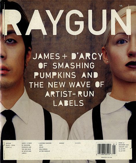 |
| RAYGUN magazine breaks convention by never having a defined brand font or color scheme. They have established this uniqueness from magazine to magazine as their brand. The only constants I've picked up on, after looking through their library, was the use of this "cutout" sans-serif font for headings and their masthead is always shown in front of the cover model. Their color scheme varies from extremely muted to a triad of strong primaries and secondaries. Their placement of visuals and text is erratic. The cover rarely has cover lines, only ever includes the tagline. |
 |
| Rolling Stones Magazine covers and spreads have changed drastically through the decades, from the 80's use of bright color schemes with fun model shoots to the dark hit of the 90's when black made an appearance in every cover and their content became more music-centric with contentious photo shoots. Most of its content now is science and music based presented in a very clean cut, graphic way with the use of a lot of color blocks to separate topics. Fonts are generally sans-serif or serif-ed depending on content. Every issue includes their signature red. The masthead is sometimes outlined or one full color. Modern issues mainly use a white background with the cover mode in front of the masthead. |
⭐ Rebellious/Beauty - Fashion, music, drama
Example
Dazed & Paper
 |
| DAZED Magazine's color scheme varies wildly every issue but primarily uses white for their masthead. Masthead can appear both in-front or behind the cover model. their overall structure is devoid of too much text and focuses on story telling with pictures and colors. They use large photos when collaging their spreads and have a similar organization to RAYGUN's with the primary difference lying in the fact that they are more conventional, such as their use sans-serif font for titles and serif font for articles. Both of these examples, prefer to showcase on-the-rise artist. |
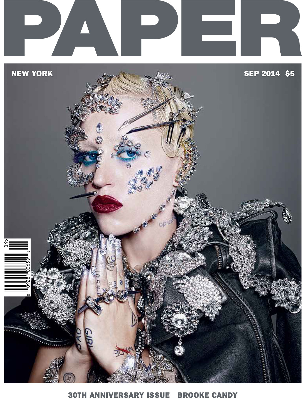 |
| PAPER Magazine is very conventional, always including a squared image forming a negative space border for the masthead and image, only sometimes do they not include a border and even more rare is the cover model intervening with the masthead. The issue number, date and bar-code are usually in the same place, across issues. The shots used vary from full to head-and-shoulders, usually made in a way that calls attention in a contentious way. The use of strong imagery extends to their spread layout. Their spreads are very minimalist and consistent, usually having a white background to not distract from the imagery and story. Each page or spread usually follow individual color schemes, usually focusing on one or two colors. |
⭐ Modeling/modern - Fashion, lifestyle
Example
Allure & Vogue
 |
| Both Allure Magazine and Vogue America follow the conventions of a fashion magazine, cover model in-front of the masthead, one color or picture cover backgrounds, font changes within cover lines and lots of ridiculous coverlines. Other tropes it follows are abundant advertisements about beauty products or luxury items with a focuses on the models showing of the product. Pretentious skinny font and enormous capitalization at the beginning of their articles. Usually dull to white color scheme with a couple sprinkles of color depending on what they're collaging. Both examples make "who wore it better?" comparisons and report on celebrity looks. |
 |
| Made with the same specifications as the previous one, with some exceptions. Vogue is more luxurious, almost exclusively using picture backgrounds to outline their cover models and skinny, tall sans-serif font for their cover lines. Every issue's cover model is always a celebrity or musician. |
Example
Soap Opera Digest & People
 |
| Soap Opera Digest features large white and yellow impact fonts for every cover line, with yellow emphasizing "grabber" phrases. Its cover format usually has a top and bottom gradient border, with the gradient changing issue to issue. Every issue has a headlining soap opera, who's main cast is pictured thus taking up most of the cover. Spreads usually include one color backgrounds with soap opera actor cut outs and lots of column text. The content is primarily soap opera series speculation, summaries of past season, a canon expansion of a series character or even a transcript of an interview of the actors. |
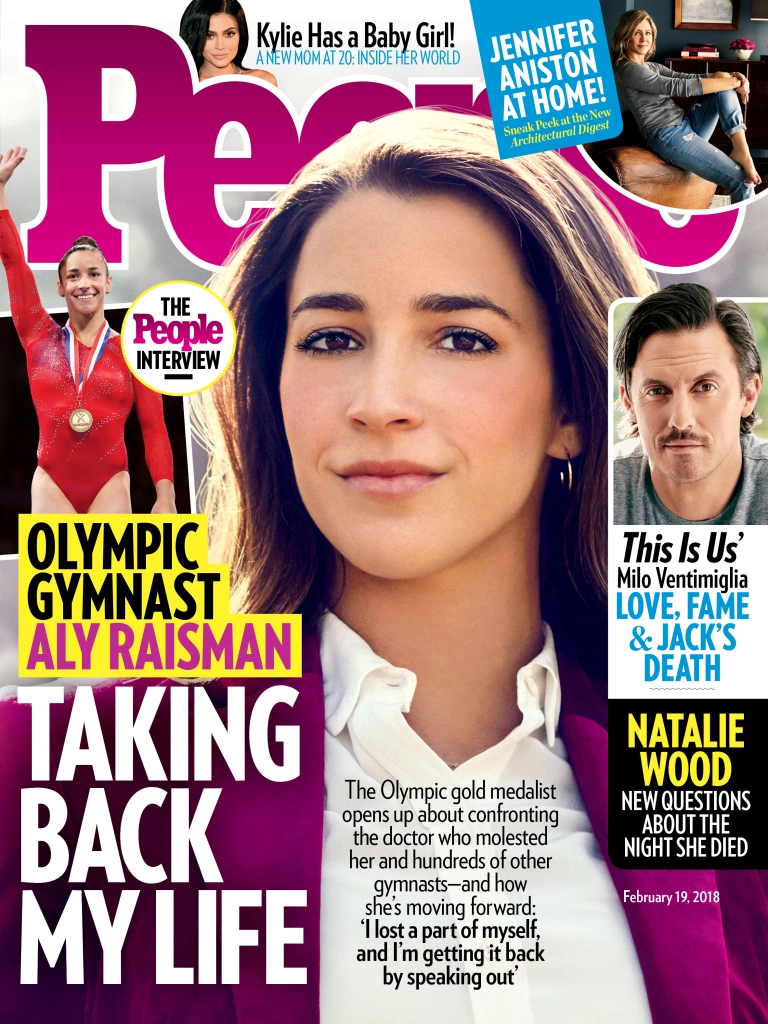 |
| People Magazine is a lot like Soap Opera Digest when it comes to the cover with its use of color, cover lines and impact font with it's main difference being that it's not exclusively about Soap Operas. Their spreads are text heavy with pictures on either side making sure to crowd the whole page with both. Most of these pages are accompanied by full page photo, usually an advertisement. Uses a lot of before and afters and "who wore it better?" comparisons and item cut-outs for their lifestyle type articles. |
⭐ Science/clean photography/history - Informative, News
Example
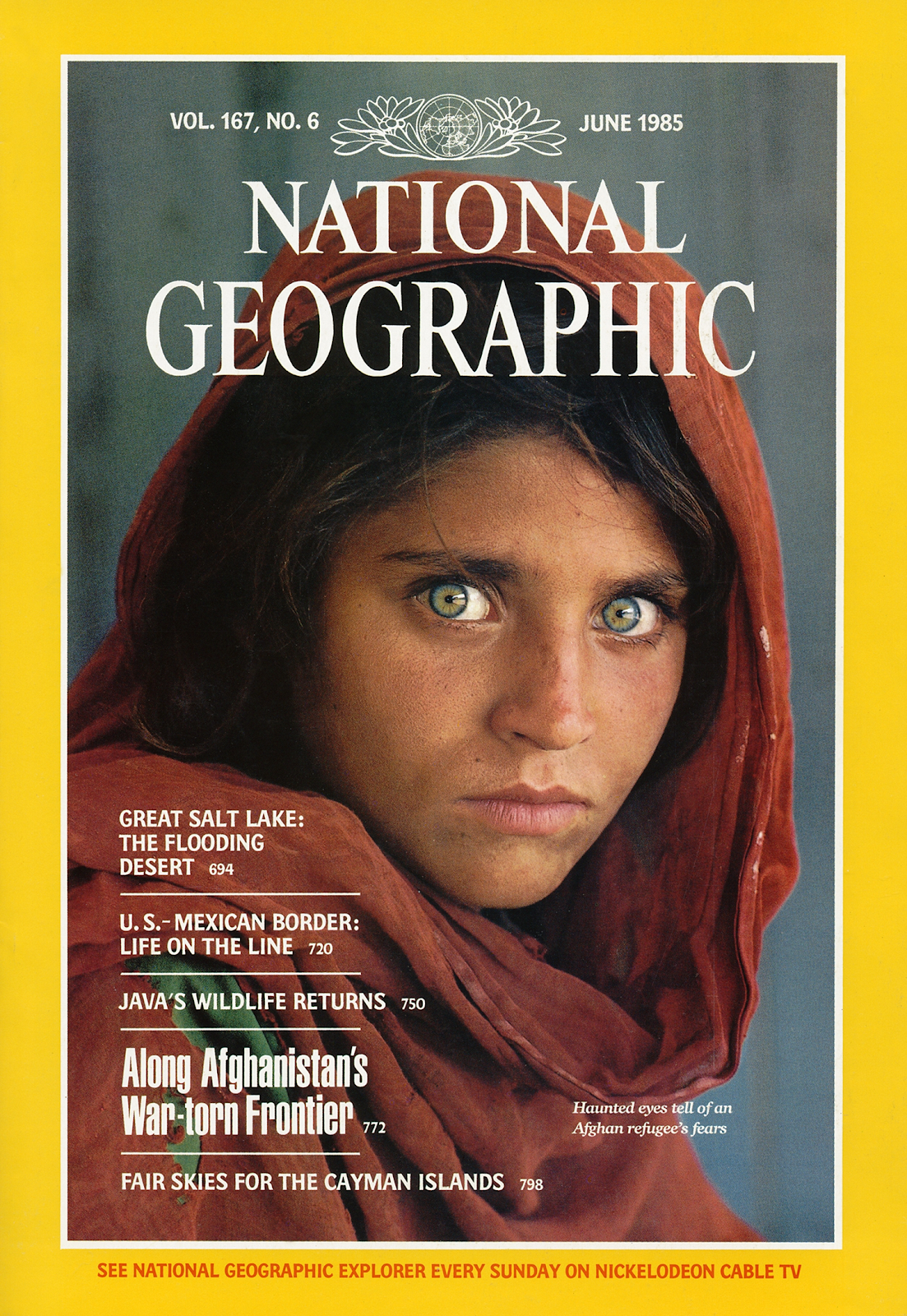
Time & National Geographic


No comments:
Post a Comment