 Hey again!
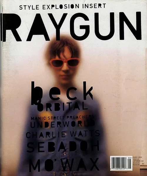
I have decided to base most of my look and content on Time, Grind, RAYGUN and the Rolling Stone magazines. I'm going for an overall grungy, natural, muted look with hints of professionalism.Me and some of my potential partners to this project were discussing themes that are both relatable and attention-grabbing, eventually coming up with "Body Positivity" as our theme. We knew we couldn't all do the same topic, instead, we came up with doing different approaches, and mines (as a huge art enthusiast) is the expression of body positivity through art A.K.A. body painting. And thus, out of a variety of different boring stylistic approaches I've chosen this moody, punk, washed-out color theme.
Inspiration


No comments:
Post a Comment