"Short Kings" - Color Palette Ideas

In my swatches, I visually show how much of that color I'm planning on using and what my paint stroke assets would look like. To establish a cohesive palette I took sampling from the pictures.

This one is based off the shots
The light blue and red could work very well with blending the pictures together as the page's backdrop.
It does not make the dark red and white assets look jarring.

Based off my original ideas for the section.
Originally I wanted to do a completely green page using only neons and dark greens.
Very monochromatic compared to the other swatch.

"Short Kings" Photoshoot 2

"Short Kings" Photoshoot Continued...

Now it was Joseph Nieve's turn. 
I had planned to take pictures of him 4 weeks in advance from when we actually shot it. Thankfully, we got the opportunity to convene at the gym, we went outside for a better composition.
All the shots came out good in my opinion. When I was photographing him the only problem I ran into was my own indecision. I wasn't sure about what mood I wanted him to convey nor what I wanted to include or elude in my shot. In this case, I just let him do his own thing, the only direction I gave him was to "look casual" Another problem I ran into was the overexposure I was getting because of how evenly bright it was outside

All the images from that photoshoot:
My favorite pic from the photoshoot because of it's authoritative nature which plays on the section's theme.


"Short Kings" Photoshoot

As is going to be a common theme with these photoshoots, time was of the essence due to the heavy workload from other classes and many of my afterschool responsibilities.
After a 2 weeks of planning with my good old friends Alejandro and Ruben, we had finally lined up our schedules. I shot the photoshoot at the Checker's 5 minutes away from the school. While we were enjoying our pizza before the shoot, I was examining what sort of compositions I can pull off with such limited scenery.

This Checker's is very retro and picturesque. It's built to only be a drive-thru with no actual restaurant qualities besides the very limited and unclean seating. Then, there are other factors beyond our set, was the boring street-view backdrop we had at all angles and the limited supplies I had to make this sufficient photoshoot. I had only brought a camera and a couple white papers to scatter the natural light, nothing to clean the seats or make a dent in the harsh shadows I was getting.

The following series of pictures are all the ones I took for the duo shot, as you can see I was trying out different angles and waiting for the wind to pass
at a bit of a Deutsch angle but with relatively good lighting.
the boys weren't ready for the shot

Still at an angle, very nice lighting, Ruben and Alejandro's anxious phone position mess up the shot though.
No angle, backed up 3 steps, bad lighting on Ruben, who's also not smiling.

Better lighting, frame slightly uncentered, Ruben still has too much of a stern expression, Alejandro blinked.

Ruben is still holding a strange expression.

Not great lighting or centering but otherwise everything else is fine

First Step in Final Design

Asset Creation

In order to begin designing my layouts, there are a few steps I need to take.
1. Take the pictures of my subjects
2. I need to decide on a final color palette. I'm being careful to create my palette based on the composition of the pictures I took.
3. To boost the appeal of my magazine further I want to create custom font titles.
4. Closely reviewing my theme, purpose, and color palette begin to create my layouts using Adobe Photoshop and Illustrator. That's where I get more technical with design elements. During this process, I plan to experiment with different:
   - backdrop fills
   - design elements
   - cut-outs

Male Model Profiles

Male Model Candidates

For my Short Kings section I had multiple contenders since it was the only male spot in my magazine, additionally, the fact that it is dedicated to short men which are virtually superfluous in my highschool.
Elkin Correa (5'6'')
Everything you want out of a male youth model
He has a mature style yet he knows how to stay on trend
His only detriment is the fact he's too shy.

Joseph Nieves (5'7'')
Similar Elkin in fashion but much more business casual
Elegantly photogenic, with a dashing smile
Good at keeping in touch and has a schedule that works with mine.

Moises Casanova (5'6'')
Photogenic and handsome when not caught off guard 
Has a modifies style to typical Hispanic kid at my school, he loves to wear chains
Not a very flexible schedule thus not an option


Ruben Calderon (5'5'')
Flexible schedule and has lots of potential
he the second shortest on the list and also one of my good friends 

Alejandro Maciel (5'4'')
Another one of my close friends with a flexible schedule to match
very cute and boyish in nature, but it is very awkward with photos when he has no direction.


Female Model Profiles

Models

Rickia Talbert

- Shapely women of color with a phenomenal academic presentation
- Shines brightly with confidence
- Brightens people's day with her lovely smile

Pricilla Pareira
A good representation of the hard-working woman
Can also be a stand-in for most teens with her fashionable casual style
A good representation of tall women.


Looking for Models/ Model Criteria

Model Criteria

"Love, You" Body Confidence Shoot
  • Women who don't fit body standards
  • Curvy, shapely, and women of all backgrounds and heights
  • trying to be as representative as possible 
"Short Kings" Male Body Confidence Shoot
  • Men 5'7" and under.
  • Can be of any appearance
  • Can be of any background 
"Body Identity" Body Dysphoria Informative Shoot
  • Transgendered people
  • People in general who suffer from dysphoria

Content Inspiration and Analysis

Analysis and Inspiration

When thinking of the kind of magazine I wanted to create I knew that I wanted it to be different from other body-positive magazines like Plus and Dare. I want to introduce and showcase other forms of body-related unsatisfaction. Themes like how standards have an effect on both men and women and how in a more serious light it can lead to mental distress. For that theme, I plan to present trans people suffering from Dysphoria. Plus size women tend to get more exposure and acceptance than short, unshapely men and trans people whose mental torment attached to appearance usually goes under the radar.

Photography Inspiration and Analysis


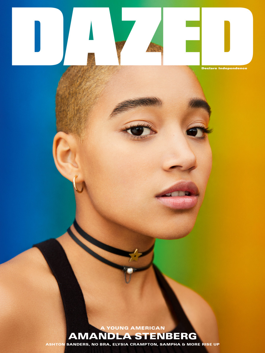
Amandla Stenberg Dazed Cover - Fashionista
Free Clinique lipstick inside Glamour magazine! | Thrift O'ClockMany Fashion and style magazines favor these kinds of
headshot type spreads, decorated with little to no text. From what I have seen in magazines like Glamour... stoic close-ups similar to this one are popular amongst the genre. In Paper they are mainly used for the cover but in Glamour they usually use it more spreads. This one specifically is of Amandla Stenberg, who had come out as non-binary and bisexual a year prior to when this cover issued in 2017. Dazed chose to frame her in this colorful background representing the LGBTQ+ community and paired it with her shaved head, no make-up look, which is reminiscent of how she identifies to create this stunning clean yet punk-looking cover. I want my cover to have a similar feel but since I have not chosen which article I want to be my feature yet, I do not plan actually executing the same theming. At the moment, my plan is to make my Love, You article my feature but that's subject to change.

Masthead Inspiration and Analysis

Analysis and Inspiration 

As stated in my previous post on the codes and conventions, the masthead is an extremely important detail meant to visually summarize your brand. In planning stages, I knew I wanted the magazine to come off as a sort of satirical take of Vogue and Similar top fashion magazines. Why Vogue specifically? What makes it satirical is the fact that my magazine's focus is on the same group of people they staunchly exclude from their magazines and marketing is ironic.

For the actual masthead, I combined Vogue's tight kerning and tall serif font and Paper Magazine's boldness. To stylize it, I emphasized the tallness of the font by reducing its width and then I colored it according to my main spread. I wanted the reader to know that this magazine is about beauty, fashion, and has an aspect of elegance. I used Paper Magazine's format to embolden my magazine's purpose, it adds a sense of rebellion and loudness which clashes with the font's class.

Sources

https://www.amazon.com/Vogue-Magazine-September-Issue-Taylor/dp/B07WC9LHYZ
https://issuu.com/sudarshanbookdistributors/docs/vogue
https://www.vogue.com/article/from-the-archives-vogue-looks-back-at-120-years-of-covers
https://models.com/work/paper-magazine-paper-magazine-winter-2015-magazine-covers/455144

Magazine Design - "Short Kings" article

"Short Kings" Article and Shoot

Insert short Kings article info and art
★ 3-4 boys who are under 5'9''.
★ Medium length article on male body standards based on information of the internet and the boys'        commentary.
★ Photography-forward spread
- large centered photo of my three models
- Forced perspective shot using a low angle that exudes confidence
- Wide eye-level shot to decorate the bottom
★Green color palette
★Interview questions like:
-Do you consider yourself short? If so do you get called out for it a lot?
- Has being under 5'9" affected your social standing or confidence?
- How do you express your confidence most? Through fashion or some other way?

Critical Question 4

4. How did you integrate technologies – software, hardware and online – in this project? Prezi presentation on how I integrated on suppl...