Analysis and Inspiration
 As stated in my previous post on the codes and conventions, the masthead is an extremely important detail meant to visually summarize your brand. In planning stages, I knew I wanted the magazine to come off as a sort of satirical take of Vogue and Similar top fashion magazines. Why Vogue specifically? What makes it satirical is the fact that my magazine's focus is on the same group of people they staunchly exclude from their magazines and marketing is ironic.
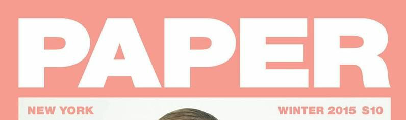
Sources
https://www.amazon.com/Vogue-Magazine-September-Issue-Taylor/dp/B07WC9LHYZhttps://issuu.com/sudarshanbookdistributors/docs/vogue
https://www.vogue.com/article/from-the-archives-vogue-looks-back-at-120-years-of-covers
https://models.com/work/paper-magazine-paper-magazine-winter-2015-magazine-covers/455144


No comments:
Post a Comment