"Short Kings" - Retouching Process - Group Shot

Ruben and Alejandro Retouch Shot
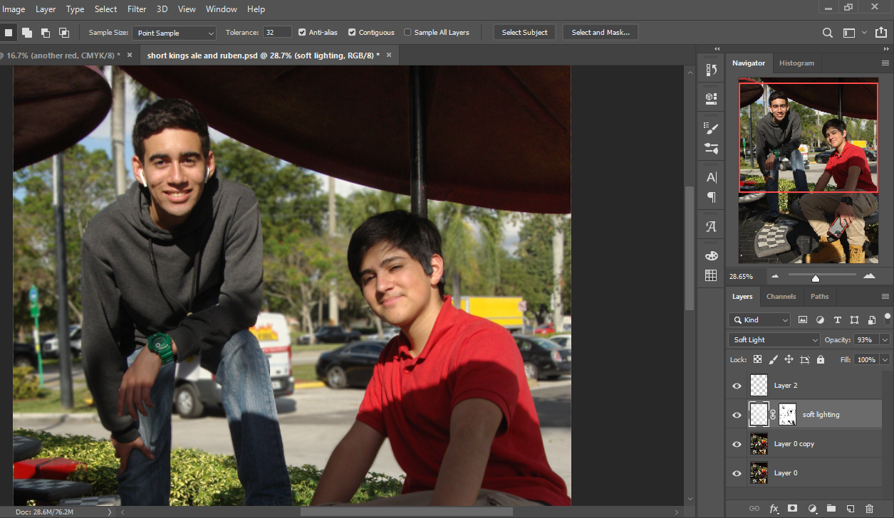
1. image rotation- 90° clockwise
2. Open a new layer with a white to transparent gradient in the corner to brighten up the image.
3. I only want to brighten up the dark parts so I make a color range selection on all the dark parts.
4. Use the selections to create a layer mask on the gradient layer. I select hide from selection.
5. I select the distant background and apply a box blur to help establish a  visual hierarchy.
Finished result.


"Short Kings" - Retouching Process - Solo Shots


 Joseph Solo Shot

1. I tried to level out the colors first by adding saturation with a hue/saturation adjustment layer.
2. I fixed some of the strong shadows by creating a curves adjustment layer.
3. Lastly, I cropped all the awkward space away and used the rule of thirds to center his face in the uppermost row.

 
Finished product

 Joseph Solo Shot 2

1. I wanted to preserve my lighting from the previous shot.
2. Next, I added another layer adjustment to fix the coloring
3. Then, I cropped it to make his head the center focus.

Finished product

Table of Contents Inspiration and analysis

The table of contents isn't really bound by a precedent of my theme, it's usually purely aesthetic
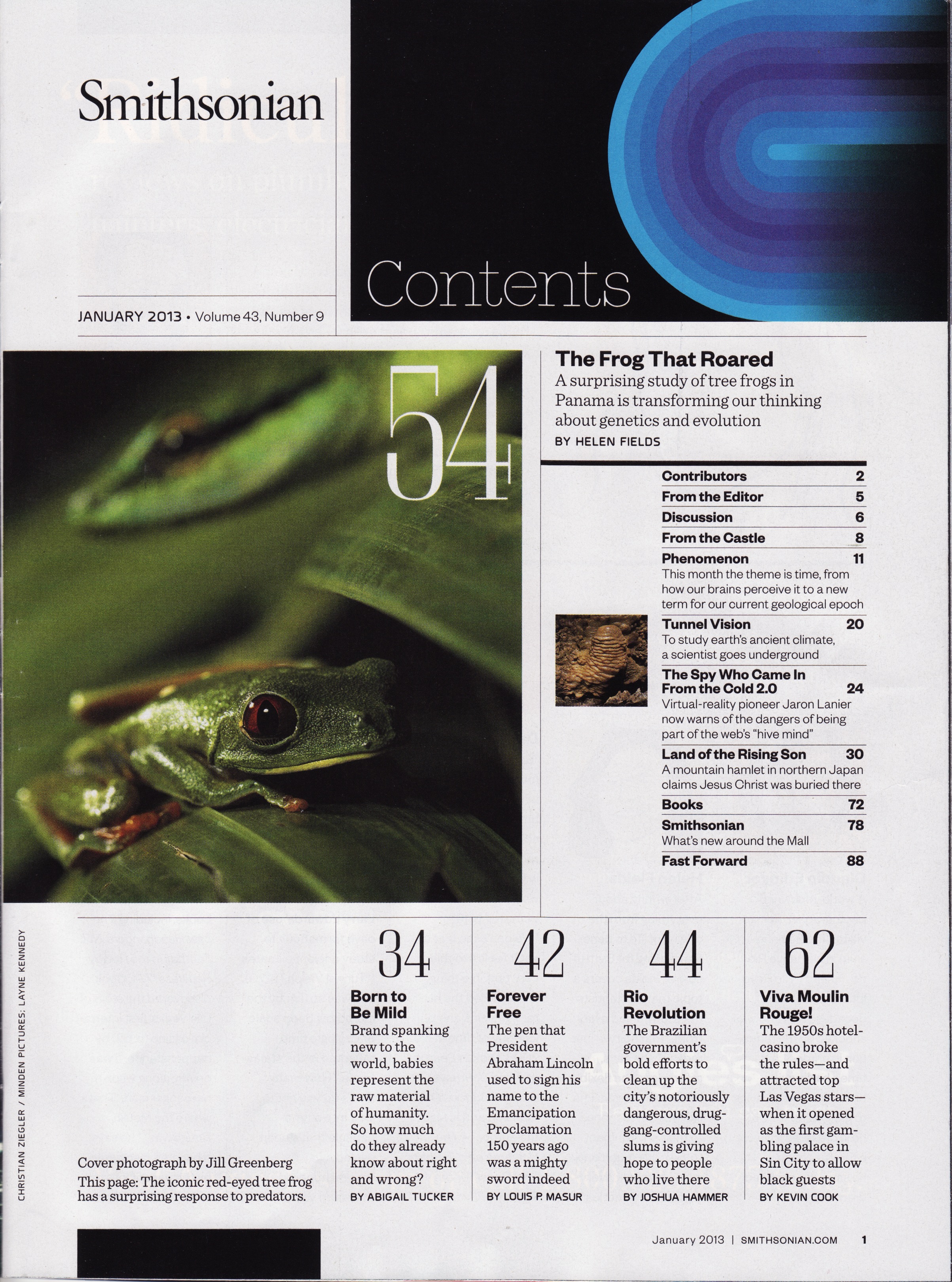
I will be using this example from The Smithsonian as my main inspiration.

My organization will go like this:
Make body identity and short kings into half pages on the same page before the two page spread
Table of contents will be the first left page
grid format with hierarchy dependent on size with short descriptions, similar to this Smithsonian table of contents. 
Image result for magazine table of contents

Cover and Table of Content - Color Palette Ideas

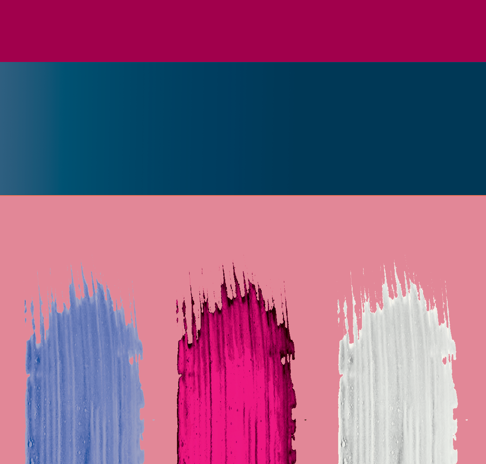
My feature story will be my "Love, you" 2-page spread which is mainly a monochromatic group of pinks so to make the cover and spread cohesive I should keep it in that realm of hues. As for my table of contents and extra pages, I was thinking something cleaner like whites or differing hues of light grey. I won't be including the table of contexts swatches since it's very visually limited
Instead, here are the cover swatches:


"Love, You" - Color Palette Ideas

the Love You palette in my mind has always been a various shades warm pink and cool purples

Original Palette uses various desaturated pinks
Too desaturated to be considered pastel.


This was my second attempt at trying to come up with pink and blue palette.
Now it's far too saturated and bold
This is the same as the palette above just that it's been bit desaturated and lightened
This is the closest I've come to the pastel tones I was looking for.


"Body Identity" - Color Palette Ideas

Since the initial shoot came out very warm I created a mainly warm set of swatches.
Like with Short Kings, I already had an idea in mind for what I wanted my layout to look like.
Due to the limited money and time for this project, I can't go out of my way to buy a matching outfit or set for it. Additionally, these colors don't invoke my artistic image as I thought they did previously.

This specifically really works with her skin tone and initial outfit. I included that one blue to throw off the monotony of the warm tertiaries. I modeled the brown from the frames in the background.


Critical Question 4

4. How did you integrate technologies – software, hardware and online – in this project? Prezi presentation on how I integrated on suppl...